This post is part of a series on a project I am doing to build banking architecture.
One of the great things about tackling a new project is that you get to work on many different aspects. With a decent amount of functionality tied down, I decided to do some work on the design of the brand and application.
Logo
As always, a first stop is the logo. I found an icon from The Noun Project and a great font from Creative Market for a total of $11. Putting these two together I came up with the design below.
Vertical
![]()
Horizontal
![]()
I’m new to design, but am pretty happy to be getting more involved. To aid the process I’m making my way through The Elements Of Graphic Design which is giving me loads of insight.
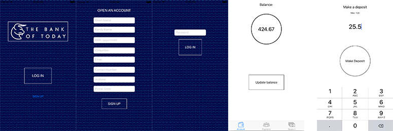
iOS app design
With the new logo in place, the app was updated with new landing, sign up and login pages. The rest of the app was also updated with new design. It’s still a rough sketch, but definitely going in the right direction.
UX updates
A number of UX updates have also been put in place, allowing better handling of errors and process flow.
Conclusion
With the new design in place, the direction for the look and feel is on track. The app will be polished in the coming weeks, along with some additional functionality.
As always the code is on Github.